Thursday, June 30, 2016

Introducing: The June Collection

Before I left on my two week trip, I did my best to set myself up for success with this month's collection.  Based on work in my sketchbook, I knew that I wanted to make a collection of watercolor "planets" with ink designs.  So, before I flew out, I had all ten works painted with at least the base layers of the watercolor and I packed up all my pens and everything I thought might be helpful.

That first week out of town, I didn't do any work!  I was having so much fun adventuring, was up early in the morning, and exhausted at night, and it just didn't happen.  The second week, I knew I had to be deliberate in making time.  Although I was in D.C. that second week, I was able to arrange my days better and I made the time to focus on my work.  Before I got back to Dallas, I had finished three works, two in progress, and one I had a very clear idea for.  I felt really nervous about finishing everything up in time for listing the collection today!

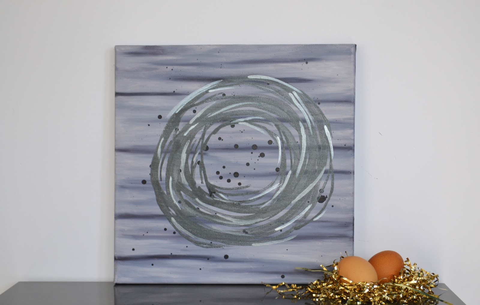
The first piece I finished is "TRIBUTARY".  I worked on this piece in the hotel and I felt very held up by fear in starting.  When I finally got over my fear, I picked up a grey pen and started drawing.


The second piece is "THE SURFACE OF THE SUN".  I love this piece because from a distance, the painting looks like a simple painted sun, but up close you can see the geometric design on the surface.


This close-up shows how the geometric design fades in and out of view based on how saturated the watercolor is on the paper.


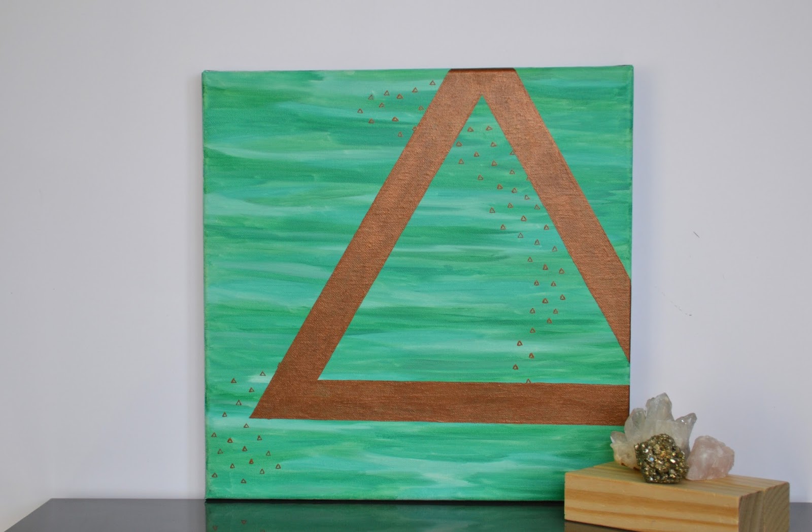
The next piece, "STAY CONNECTED" was finished on my flight from Washington D.C. to Dallas.  It was the smoothest flight I have ever been on and I didn't have any trouble drawing the metallic gold triangles.  This piece positively sings in the sun and the contrast between the gold and the dark watercolor is gorgeous.


"MOON SHADES" is a fun piece that is inspired by the movement of the moon across the sky.  It's perhaps the simplest piece of the collection, but it is beautiful in its simplicity.


"ROY G" was an experiment of sorts as I tried out different line patterns on each planet.  I love how this piece came out, so it informed my next piece.


In "STAGGERING", I used more linear patterns on each planet, but I still used the same pen for each planet.  I love that the watercolor underneath the patterns is visible and changes the way the pattern appears.


This piece, "MOON SHINE", was a favorite from the beginning and I knew I didn't want to cover the movement of the watercolor planet.  Instead, I made radiating gold dots and I love the effect it made.


With "CENTRAL", I created a grid with horizontal, vertical, and diagonal lines, but the organic nature of the lines, keeps the piece from being too rigid.  The gray grid really pushes the planet forward and I love the depth it creates.


When I started "WHAT IF THE SKY WAS PINK?", I knew it was a great idea, but about a quarter way through, I was having second thoughts!  The very little triangles that make up the background of this piece were time consuming, but incredibly worth it.


"ON THE GRID" was the last piece I finished, and just yesterday, too!  I was going to make a similar grid as "CENTRAL", but with a finer point pen, but once I had drawn the very thin horizontal and vertical lines, I decided that I loved it and left it.  This is the piece that I decided to keep!


This collection was so much fun to create.  Painting the planets and creating the lines and patterns combined a soft and and uncontrolled element with the controlled and rigid pen lines.  This is a favorite collection and I intend to make more of these in the future!

For more photos, information and prices, check out the links of each piece's title.


Tuesday, June 28, 2016

Utah Arts Festival 2016

The day after I flew back home to Salt Lake City from my Dallas/D.C. adventures, we went to the 40th Annual Utah Arts Festival.  We've made an effort to go every year since we moved to Salt Lake and this year was just as fun and inspiring as the previous years!  This year, it was interesting to recognize artist that seem to be there every single year we've gone, but it was so, so fun to see artists and work we've never seen before!  I want to share five of my favorite artists from the festival, but there were so many great artists there!

One of the artists that I didn't know about before was Johanna Mueller.  As soon as I saw her work, I was instantly in love with it!  She creates relief engravings, monoprints, illustrations, and paintings that tell stories through the depiction of animals.  The photo below is taken from her website and it was my favorite piece of hers at the festival.  This work is titled "Beneath the Land".


The second artist that I want to share is Aaron Fritz.  Aaron's paintings are full of rich color and movement.  Although there aren't any photos of his abstract nudes on his website, which are the pieces I really loved, there is still a lot of great work that give the sense of Aaron's style.  The piece below is titled "Fourth of July" and this photo was taken from his website.


Kevin Zuckerman is one of my favorite artists and I discovered him at the Utah Arts Festival in 2012, when we bought a painting from him that now hangs in my daughter's room.  I hadn't seen him at the festival since then, so I was thrilled to see him this year!  Kevin is an amazing artist who has mastered several mediums including oil paint, sculpture in bronze, and watercolor.  He has also traveled about Europe studying the masters, which informs the work he does now.  This painting, "Red Feather" is similar to the one we purchased four years ago.  This photo is taken from his website.


Leslie Duke is another new-to-me artist.  I love her artist statement, and I think it says it all.

"As an artist I am continually fascinated with color, particularly with its ability to prompt an emotional response from its audience. My work explores color’s emotive capacity, focussing more on the overall atmosphere created by the color palette of each piece, rather than the actual subject matter depicted. This approach is meant to create a unique visual experience, one that facilitates an inner dialogue by quietly probing the subconscious."

This photo of this painting, "Summer Blues", is taken from her website.


The last work I want to share with you is by a husband-wife team, Steve and Bonnie Harmston, under the name HarmstonArts.  They are fine art printmakers, and I just know I've seen their work before.  This duo has a beautiful biography on their website about working together and keeping the process of their hand pulled serigraphs as simple and technology free as possible.  I love that they only made small editions.  As a collector, I always look for that in prints!  This photo below, taken from their website, is of one of my favorite works, "The Color Farm".


Thursday, June 23, 2016

The January Collection

I started off the year by painting a collection of portraits.  All of these paintings are oil paint on 12"x12" canvas.  I painted all the backgrounds of these pieces first and then painted the portrait.

The first painting I finished is KAITLIN.  I love a lot about Kaitlin and her success encouraged me to continue painting the other nine paintings.


ALEX turned out really great with the cool blues.  This is one of those paintings that looks great from far away and really interesting up close.  I used a lot of shades of blue and was able to achieve great texture and depth of color.  I also really love the background too!


CATHERINE ended up as one of my favorites of the collection and I haven't been able to let her go.  The background on this painting came out as an experiment when I ran out of paint and I love how it worked out.  This piece is also really great because I can feel the mood it evokes and I feel sad for her.


GWENETH was another experiment and I love the dark shading on the side of her face.  It was interesting painting that because it started out really small and just grew, and grew until I felt like it was the perfect size.  I think it's my favorite part about this piece.


EVETTE is another cool girl.  Instead of the loose and flowy hair that I had been painting, I wanted to try a more structured approach.  It definitely makes Evette feel more formal!


EMILY is the first of the second half of the collection.  While I never intended there to be a clear difference between the first five and the last five, it just worked out that way.  I started to really love the backgrounds and I felt a resistance to painting over them, so I simply decided not to paint over the faces!


BARBARA is another painting with a very cool background.  Most of the backgrounds are monochromatic, so that makes this one a little different.  This one was also really fun to paint and kind of a challenge to mix the perfect grays.


TAYLOR is another favorite because I just love the colors so much!  This painting is edgy, bright, and splashy.  I love the structured hair and all the clean lines.  I will be a little sad the day this painting ships out!


I love ALLIE.  The pinks and purples in this painting look so good together.  I love the way her hair turned out with its highlights and lowlights.  I also really love the background on this one, too!


MORGAN is another favorite that I could not bring myself to list in the shop.  I love everything about this painting from the background, to the simplicity of her face outline, to the many shades of pink that make up her hair.  She is so lovely and I really need to find a place to hang her in my house!


Eight of these paintings are still for sale in my shop and you can access their listings directly by clicking on the link associated with their names.  You can also find more photos, including detail shots, on their listing pages too!

Tuesday, June 21, 2016

The February Collection

For the February collection, I didn't start with a clear idea what I wanted to create, so this collection isn't as cohesive as I would like.  Each piece is unique and truly one-of-a-kind!


The first piece is titled "A Light Dusting".  I love the layers in this piece, but it didn't quite seem complete until I added those gold dots!  The dots descend down the canvas and collect at the bottom.  For photos of this painting in the sun, check out the listing by clicking on the link.


Next is "Inversion".  This piece gave me some real trouble!  I went through several cycles of "I hate this" and "I love this", but I ultimately like how it ended up.  The colors and the translucent layers on this painting make it really interesting.


"The Symbol of Mountains" started out just like the other two, but instead of dots or lines, I added tiny triangles and one big triangle.  The greens and the bronze really complement each other.  This painting also shines in the sun and there are more photos of it on the listing!


When I started working on "Dead End", I purchased inks for the first time and I was dying to try it out.  Inks definitely behave differently on canvas than they do on paper, but I still had fun with them!  The ink in this piece is the splatters.  The background is painted in oil and the silver bar is in acrylic.


"Crop Circle" is also another experiment.  After painting the background in oil, I used the ink to make the blue drips.  I thought the ink would drip down pretty easy, but it was actually a bit of a struggle!  Then I painted on the god acrylic stripes and used oil for the last black circle layer.


"Yearning" is the first of the last five paintings, which actually make a collection in themselves.  Nests have been all the rage with a lot of artists, so I wanted to create a few myself!  This painting has an background in oil and the splatters and the nest are done in ink.  The iridescence of this ink makes this painting glow in the sun!


The second nest painting, "Twins", was made similarly.  I love the colors in this piece!  The lavender background and the deep purple eggs just make this painting so gorgeous!


Here is a photo of "Twins" in the sun!


"High Above" is the only nest painting that I did not use iridescent ink on.  The nest is still made out of ink, but it's change in values comes from the ink pooling or thinning on the canvas.  I love the organic feel of this piece and it's definitely a favorite!


"The Gold Egg" is another favorite because of the colors of this piece, and, gold.


The close up of "The Gold Egg" shows the shine of the ink in the sun and the texture of that one, tiny, gold egg!  The photos of this painting really don't do it justice!


The last painting, which is still untitled, is the one I chose to keep.  It was really hard trying to choose which piece I would keep for myself out of this collection, but in the end, this monochromatic painting with the magenta pop of the eggs was just too good to let go.


I mean, look at this painting!

For more information and photos of any of these paintings (except the last one!), check out their listings on my Etsy shop!

Thursday, June 16, 2016

The March Collection

For the March collection, I took my inspiration from the Queen City Art Swap's "Faerie Tale" theme.  I decided to focus on castles and I tried a new medium... ink!  Ink is a lot of fun to work with, but I found there's a steep learning curve!


My first castle "Shadows and Mist" came out very nice.  I love the fluidity of the bottom of the castle and the softness it adds to the rigidity of the rest of the castle.


Next is "Dripping Courage"  I love this lavender!  This painting didn't turn out as fluid as I was hoping, but I do love how the drips build an under structure to this castle.


Another purple castle, "Above the Haze" is a definite favorite!  This photo shows the iridescence of the ink.  I love how this castle appears to have been built on a cloud!


This one is titled "The Remnant" and I was playing with the ink in a way that made it lighter or darker in places.  I think the ink really excels at this and I love the texture that emerged.  


"Heights" is another silver castle with the same idea as "The Remnant".  I really loved the shape of this castle so much that I repeated it...


"Amethyst Towers" is the only one I did not use iridescent ink on and I loved the look of it so much that this is the piece I chose to keep out of the ten piece collection.  This deep purple marbling just stole my heart and I couldn't list her!


This one is titled "Emerald Towers" is one of the shiniest castles and I love that green glow.  The ink came on very thick and I think the solidarity of the towers offers a juxtaposition to the flowing "roots".


Another favorite, "Garrison", also really shines in the sunlight.  That iridescent ink really steals the show sometimes!  I love this one for the silhouette of the castle and the way the ink gathered towards the bottom, but refused to drip down.


"Prim" was an experiment with the windows, which I realized that I didn't like as much, at least with this medium.  I feel like the ink needs more space to flow and not be constricted by adding in too much detail.


Lastly, "Let Down Your Hair" is the piece I sent off to my Queen City Art Swap recipient.  I love how this piece turned out with the minute details and all the texture that the ink had to offer.  I hope my partner likes it as much as I do!

For more photos of these paintings (especially in the sun and in the shade!), click on the link of the title, which will take you to my shop where you can browse and buy.  I hope you've enjoyed the collection for March!